Even Quaint Towns Can Be Cutting Edge
- Oct 29, 2016
- 3 min read
During my summer of travel, we spent two weeks in the Berkshires--a picturesque region of western Massachusetts straight out of a Norman Rockwell painting. No really, this is where Norman Rockwell painted!

And amid the backdrop of New England churches, glorious mountains and traditional main streets that would make any town planner jealous there's this...real and effective roadway designs for people on bicycles and on foot.

Here in Great Barrington, Massachusetts, big and bold stripped crosswalks alert drivers and cyclists that people may be crossing. The curb extends out to narrow the crossing distance and additional plantings and lighting just make it look nicer.

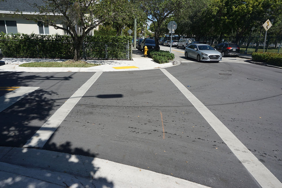
Let's compare it to the newest crosswalks on Biscayne Boulevard in Miami. A good first try, but is there room for improvement? The brightest thing in this photo is the orange shirt on the person crossing the street. Sometimes the lights on the crossing signs flash, but I often blaze right through these before I notice that the lights have been activated. A brightly stripped crosswalk and changes to the curb might make this crossing easier to see.

Here's a closer look at another crossing closer to town. Notice the thick white lines of the paint to indicate the bike lane and the row of white triangles. Who knew that safety designs could be so simple and cool! Low tech people, doesn't have to have a huge price tag.

Looks like they had fun with this one. A sort of variation on the London crosswalks which remind people to LOOK right, left, right. Perhaps a reminder to look up instead of down at your smart phone. Another important feature is the textured material placed at the end of the sidewalk ramp. It's another way to remind people on their smart phones to look up because they are approaching moving traffic!

Well, it kind of works. At least the kids aren't distracted.

Here's it very clear which portion of the road is reserved by biking and which for cars. The broken line is a way of showing the approach to an intersection and reminds the guy on the bicycle that cars may be turning into their lane.
Another cool design element to point out is how the sidewalk extends out around the parking lane to narrow the intersection and create extra space to plant more green (or brown mulch).

All these upgrades were done within the past year. What I like about this sidewalk are the distinct zones for walking and sitting which are created with different paving material. The brick defines what we planners like to refer to as the "furniture zone". Lights, trees and benches go here. The rest of the sidewalk is for walking. Slabs of concrete have been scored to create a more decorative paving pattern on the cheap. And I think it works quite well.
This photo was taken in front of Ruby's Cheesemonger shop. It's a converted bank with a cheese shop in front and a lovely sandwich bar in the back. Too bad the New York Times beat me to this shot in this month's Sunday travel section featuring the Berkshires as a foodie haven.

And lastly a shot from Stockbridge, Massachusetts which is mentioned in James Taylor's song Sweet Baby Jane and always gets a big cheer when he sings it down the street at the famed Tanglewood Music Center. If you don't know what I'm talking about look it up!
Stockbridge must have applied for the same grant money at Great Barrington because they have newly painted bright green crosswalks. These are super effective because they're so easy to see.
So what can we learn from this Miami? It doesn't take a lot of money to make bold design moves that improve safety for people and bikes. Take more risks and if it doesn't work Miami, we can always remove the paint!


Comments